Reviewing Your Food Packaging Labels
Having packaging designed for your food product can be an exciting time. It may involve appetizing photography, creative copy, and developing overall branding ideas. However, it is important to note that Canada has many labeling regulations when it comes to food packaging. Whether it is a single sticker label or multi-panel carton box, it is a good idea to get in touch with a packaging branding agency or a food technology centre; especially before the printing or production process. Having them review your new designs can save lots of trouble in the long run.
Some examples of packaging elements to be reviewed:
Images of flavours.

Does your product have a distinct flavour you want to call out? Perhaps, it is a fruit flavour. In this case, using fresh red strawberries can make for delicious flavour cues, however, they can also imply that those fruits are actually contained in the product. Therefore, there are labelling suggestions to keep in mind. For example, text stating “strawberry flavour” should accompany the image. The key is to not take any chance of being misleading so a consumer has a good idea of what is inside the package.
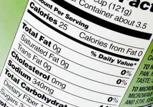
Nutritional Information.

Your product might contain essential health benefits; these could be a big selling feature of the item. It is important to note Canada’s regulations about stating health claims.
For example, a food claiming to have lots of fibre has to have 4g of fibre per 30g serving.
Here, the labelling can state “high fibre” however, other similar phrases such as “extra fibre” is not permitted. Furthermore, analytical testing is recommended for nutrients that are subject to claims.
Net Weight.
Do you want to appeal to U.S. customers? While imperial measurements (lb or oz) are not mandatory, if they are used, they must appear after the metric quantity and there must be a space between the measurements
English and French.

Laying out a panel or design is tricky with brand names, design elements, images, nutritional information, and copy to be organized. It can be even tougher when incorporating two languages. In Canada, all mandatory information must appear in both English and French in text of equal prominence. The exception is company name and address.
The information on unilingual panels must correspond (all information on the English panel must appear in French on the French panel.
Date Markings.
Sticking with English and French, the format of the durable life date is a two-letter bilingual abbreviation for the month and the date. The year (4 digits or the last 2 digits) may be added for clarity, eg. 17 JN 28 or 2017 JN 28.
The bilingual symbols for the months in the durable life date as follows:
JA for January JL for July
FE for February AU for August
MR for March SE for September
AL for April OC for October
MA for May NO for November
JN for June DE for December
These are just a few of the different categories involved in labelling review. It can be a meticulous process but it allows for clarity from the consumer’s standpoint and keeps the integrity for all Canadian packaging. Hopefully, this has provided some insights so you can ensure your packaging meets the regulations before it is sold.
Posted Oct 30, 2018 - Ryan F Talag


